Overview
Mahavitaran (MSEDCL) is Maharashtra's state electricity distribution company the utility millions of people depend on for bill payments, complaint registration, and new connections. When our team of four (myself, Tanay, Dhruv, and Soham) picked this as a project, the brief we set ourselves was simple: audit how people actually experience Mahavitaran's digital services today, and figure out what's broken.
What we found wasn't a UI problem. It was an access problem.


Before touching anything, I wanted to know what already existed. Mahavitaran runs a website and an app — both live, both in use, both clearly built for a different era of the internet.
The website still carries the visual and structural DNA of a 2018–2019 government portal: dense navigation, inconsistent CTAs, a "Submit Online Form" hero banner sitting next to a captcha-gated bill payment widget. The app fares slightly better but suffers from its own version of the same problem — too many entry points for too few clear tasks, and no real hand-holding for someone doing this for the first time.
This mattered more than it might sound like on paper, because Mahavitaran's user base skews toward exactly the people these interfaces fail hardest: elderly consumers, rural consumers, and people on basic feature phones with patchy connectivity.
Understanding the company
Understanding the user
I interviewed real Mahavitaran users and collected their raw complaints.
I put every quote on sticky notes and grouped them through affinity mapping. This turned messy feedback into clear themes: Payment, Physical office, Complaint registration, Solar, Notifications, Reliability, and Website/App. Now I could see the real pain points instead of scattered noise.

From there, I built out three personas. Each mapped with an empathy map to catch the gap between what they say and what they actually feel.
Finally, As-Is journey maps traced each persona's current end to end experience across Saying, Doing, Thinking, and Feeling, with an opportunity pulled out at every step. These maps pinpointed exactly where trust breaks Shankar at the receipt and confirmation step, Sunil at complaint submission and status, Priya at document upload and application tracking and those opportunity columns fed directly into ideation.
The three biggest opportunity areas became How Might We questions, one per persona


And then collapsed all three into one governing question
Ideation
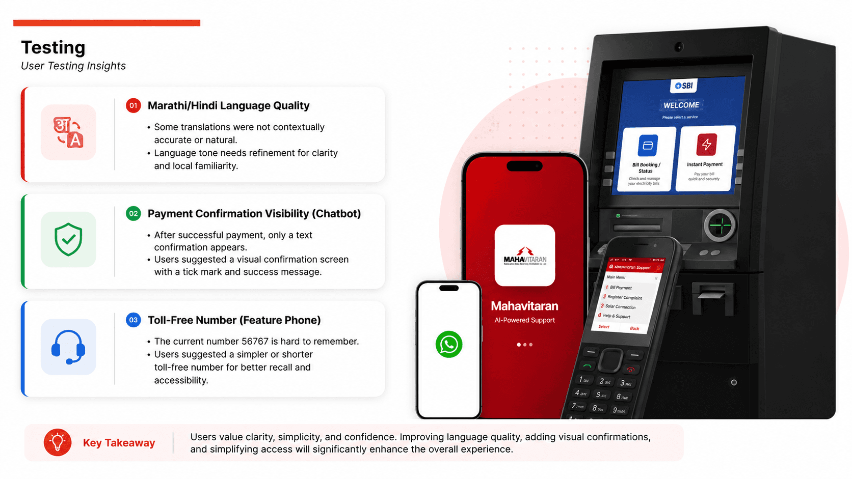
The obvious move here would've been "redesign the app." I deliberately pushed past that, because the research was telling me something more specific: the people struggling most weren't struggling with app design, they were struggling with access to an app at all or with trusting it once they had one.
So the ideation phase became about channels, not just screens. I worked through what a Mahavitaran service layer could look like if it met people where they already were, rather than asking them to adopt something new:
A redesigned To Be journey then mapped the full experience across six steps Access, Authentication, Task Selection, Execution, Confirmation, and Continuous Support. Showing the shift from anxious and frustrated to relieved and confident at each stage.
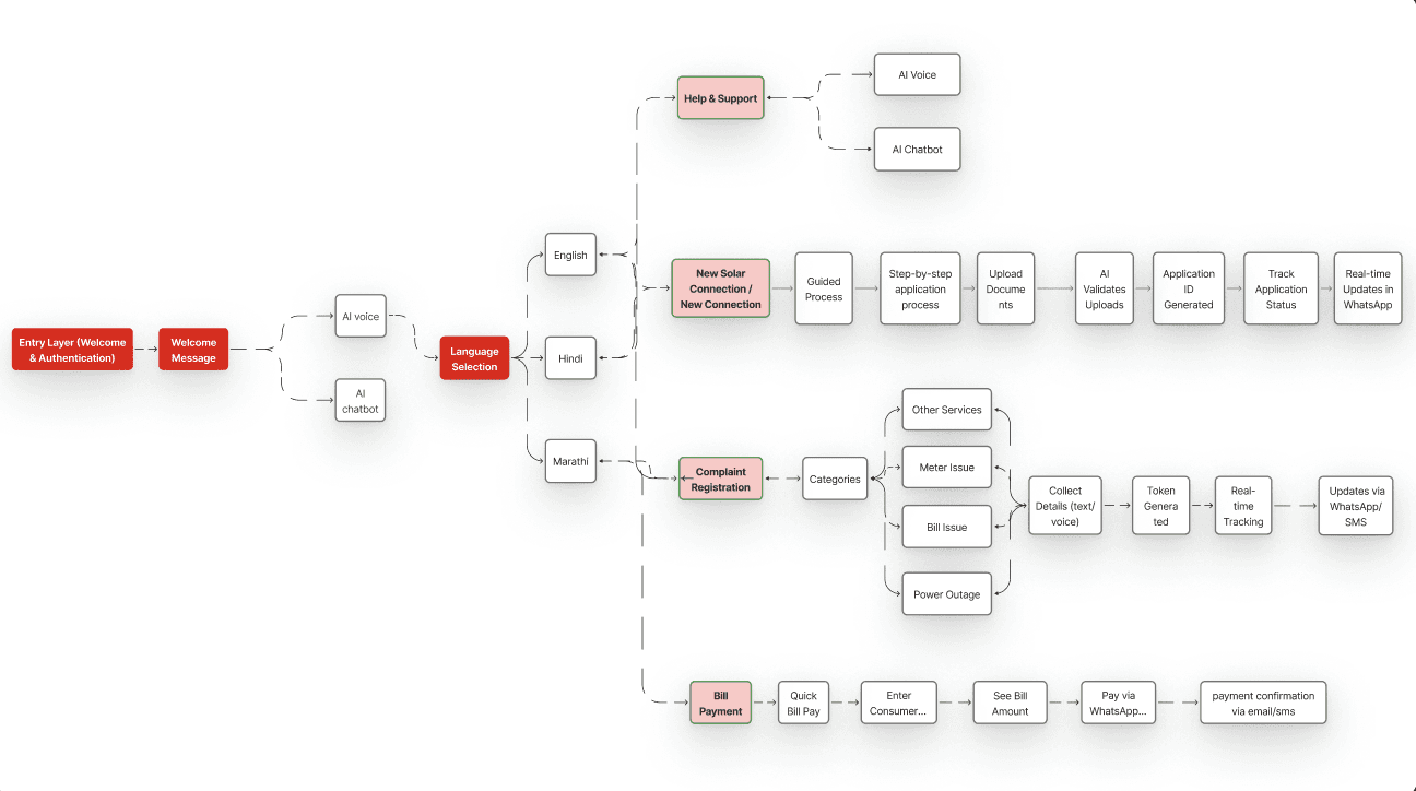
Information architecture came first mapping how a user moves from language selection into one of four core flows (bill payment, complaint registration, new solar connection, help & support), each broken into the smallest number of steps that still felt complete.

Design System
I anchored the visual language in Mahavitaran's existing red/crimson mark instead of inventing something new, since trust in a government utility partly comes from recognizing it. SF Pro carries the weight for headings and emphasis; Inter keeps body text readable at length.
Success green, warning orange, and error red — the meanings people already know, so there's nothing new to learn mid-payment. Green also does double duty: it's the one color that can't be mistaken for the brand, so "it worked" never gets confused with "the app is just being red."
Designing

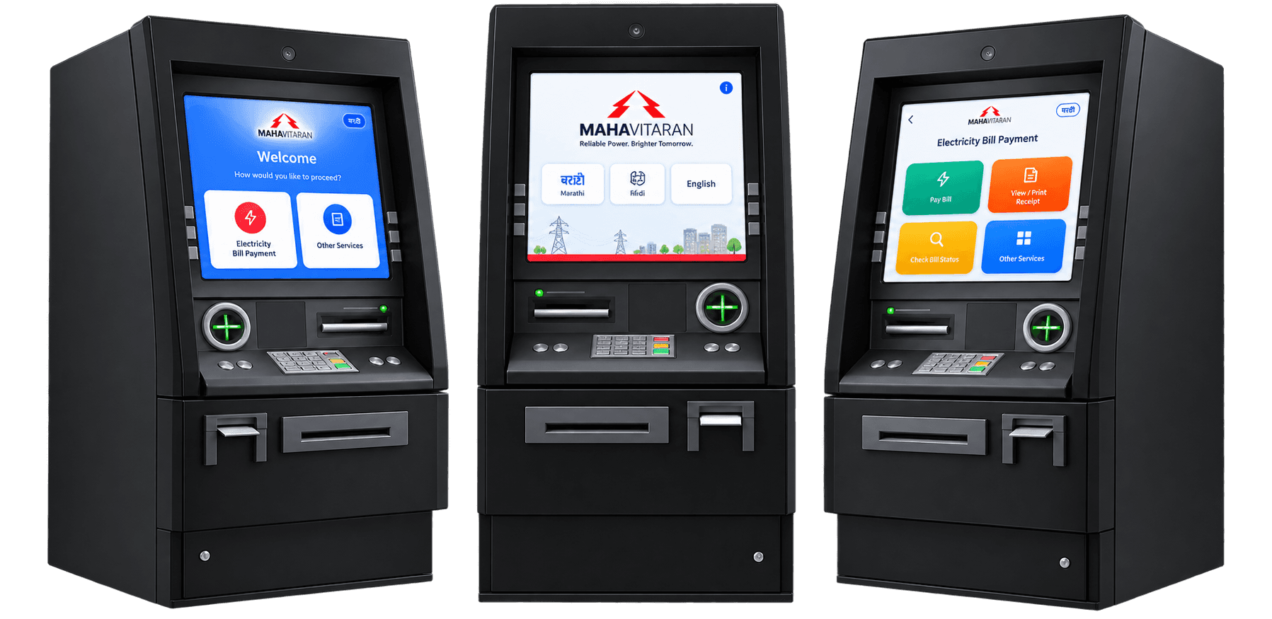
ATM / Kiosk
Feature Phone

App